Showing posts with label css. Show all posts

Thursday, 30 October 2014

The Web Is... Day One

Another excellent conference from Craig Lockwood — and this is only the first day.

I’m always impressed by the groundedness and open-hearted feeling I get when I attend Craig’s conferences. He curates the speakers not just for their intellectual knowledge and not just for inspiration, but also for their ability to connect to and understand the world and the people in it.

I’m looking forward to tomorrow!

The Web is… Knowledge

Christopher Murphy @fehler, Teaches MFA at Belfast School of Art

  • recommended reading
  • interaction design course (part of Master in Fine Arts)
    • get started with a github profile
  • teaching to see:
    • bauhaus model & visual grammar
    • point > line > plane
  • charlie munger
    • warren buffet’s business partner at Berkshire Hathaway
    • latticework of mental models
    • learning new models in related fields
    • all useful fields to understand interaction design…
  • lollapalooza effect
    • power of ideas together is greater than each by themselves
    • e.g. put a designer & developer together and get more than you would get by themselves
  • nuance and human interaction easier to learn from humans
  • master and apprentice
    • not just a one way relationship
    • master learns to see the world in a new way with fresh eyes
  • apprentice moves on then becomes a journeyman
    • going to different masters
    • gradually starting to teach others
  • ken robinson: have to move to an organic process of education
  • teach a whole mind:
    • need self-belief, manners, confidence, politeness
    • as well as skills in business, design, technology, etc
  • universities move at a glacial pace
    • takes 5 years to change a curriculum…
  • short form courses
    • patterns: josh long
    • general assembly
  • those who can, do; those who care teach

The Web is… Constant

How do we design for constant change… and not go mad

Nathan Ford @nathan_ford, Monotype, http://artequalswork.com

  • web design not yet nailed down as a discipline
  • creating repeated success in a volatile environment
  • previously worked as Creative Director at Mark Boulton Design
    • these ideas come from that time
  • team
    • bring the client into the team
    • or bring your team into the client
    • embedding
    • learn empathy…
  • look for a champion on the client side
    • someone who trudges through all the muck
    • make sure they can involve all the stakeholders
    • get the problem stakeholders involved as early as possible
  • no big reveal — eliminate surprises & blame
  • wicked problems
    • term from sociology: massive problems that are hard to define and difficult to resolve
    • web sites are a simpler thing, but their implications often make them behave like a wicked problem
  • measure goals by improvement, not completion
  • when you don’t know, try a lot of things
    • don’t be afraid to throw stuff away
    • failure is ok, but you must keep learning
  • ensure the client writes the user stories
    • can help with a workshop to elucidate
  • work in iterations
    • each iteration should include research, design & building
    • then evaluate and repeat
    • don’t forget to evaluate…
  • always have an available prototype
    • brings the pain of the project earlier
    • lets them show the working consensus to others
  • start with real content
    • if you don’t have any, make it up (NOT lauren ipsum…)
    • motivates client to actually make their own
  • build out grids from content
    • grids within grids
    • content-based items
    • no high-level overarching
  • choose the right css units
    • percent for scaling
    • vw & vh for headlines & page framing — relative to the viewport
    • pixels for media queries — one to one, easier to understand
    • ems and exes for typography
      • exes work better with newer web fonts
      • work on x-height
  • let things get big: but limit on content items
  • example: typekit blog — building out a design based on the Chapparal typeface
  • also leads to simpler testing
    • but still need to test on devices
    • especially type sizes — can be surprising on actual hardware…

The Web is… Everywhere

What we can learn from console browsers

Anna Debenham @anna_debenham, http://console.maban.co.uk

  • new style of inputs: gestures & voice
  • think about small screen and a very big screen
  • everywhere you can stick a screen, eventually there will be a browser
  • “don’t fall prey to convenience of device silos” cameron moll
  • console browser users are (currently) likely to be younger and lower income
  • consoles and web TVs have low memory
  • performance is crucial
  • the xbox browser can pretend to be a windows mobile device
    • probably added to allow simpler interfaces
  • large screen doesn’t always mean more pixels…
  • handheld consoles often have very wide screens
    • often misidentified to show full fat design
    • should probably have a simpler design
  • the PS Vita includes Amazon’s Kindle Fire Silk UA in its agent string…
  • dual screens often have odd behaviour
    • Nintendo 3DS has two screens with different widths…
  • Wii U aiming to be a full entertainment system
    • four different ways to zoom
    • really important for viewing web on TV when text is often too small
    • supports various presentation modes
      • turning mirroring on and off
      • draw curtains, prepare then reveal
      • play video on main screen, while continue to browse
    • can use multiple wiimotes as pointers
  • similar for xbox one
    • using xbox smartglass app
    • supports split screen: game/tv + browser
    • voice and gesture works really well
  • vimeo couch mode:
    • user choice for big screen support
  • microsoft’s design for xbox and windows phone is truly scalable
  • x-webkit-speech — for speech synthesis
    • currently Google Chome only…
  • microsoft has a design guide for kinect
    • really good read to understand gesture design
  • 30% of people this year used a smart TV to browse the web

The Web Is… Playful

See Lee-Delisle @seb_ly

  • http://lazerarcade.com
    • used microphones to detect nerf bullets hitting a screen
  • smashingconf opening animation
    • laser light show mapped onto a dome & pipe organ…
    • definitely worth watching the video
  • lunar trails
    • http://moonlander.seb.ly
    • records its trails into moonlander.seb.ly/viewer
    • then built a physical arcade machine
    • full screen browser, controlled by an arduino pretending to be a keyboard
    • all linked up to a giant wall-hanging plotter
    • based on polar plotter, but using DC servos rather than stepper motors
  • playfulness on the web has died a little bit
    • the little flash games got taken over by the marketing agencies
    • became viral campaigns that nobody wanted
  • internet of things — nobody knows what it’s for yet
    • much more space for being playful :-)

The Web Is… In The Hands of the 97ers

Emma Mulqueeny, Founder of Rewired State and Young Rewired State @hubmum

  • people born in 1997 and later, grew up with social media
  • those born at the beginning have no leadership
  • Ivan Illich: deschooling society
    • “educational webs … transform each moment … into learning, sharing & caring”
  • the 97ers are already doing peer-to-peer learning
  • the discussion about teaching how to code is almost irrelevant
    • the teachers won’t be teaching how to learn line by line
    • role of all-knowing teacher will become irrelevant
    • much about flipping the classroom and enabling the teacher as guide
  • refugees united: dealing with families split up as they crossed the Somali > Kenya border
    • refugees would have similar names, might lie as they’re scared etc
    • YRSer Kevin figured out that storytelling was important
    • designed service to speak a local story into the phone
    • then find stories that roughly match
    • reunited families went from 3% to over 79%
  • identity is crucial to 97ers
    • their stories (not their names) are their identifier
    • tagged photos
    • peer verification
  • try not to police community as that affects identity
  • have a very early understanding of how to influence community
    • they get immediate feedback from youtube/facebook/etc
    • have figured out how to tweak and skew their message until it works
    • can be quite an arrogant generation — they know how to get those likes…
  • going into the world
    • the most unsafe thing they could do would be to work for a big organisation
    • self-employment is much more attractive — feels safer
    • not about making lots of money — more about long-term employment
  • the Wi-Fi is the bedrock of their needs
    • it’s the gateway to their community and therefore their support network
  • they can’t engage with politics until 18 — it’s too late…
    • they engage with policies rather than parties

The Web Is… All Consuming

Keir Whitaker @keirwhitaker, Shopify

Best to watch this when the video comes out — I couldn’t do it justice with notes.

  • daily todo: 1 big thing, 3 medium things, some small things

Phil Hawksworth, R/GA @philhawksworth

  • Paul Downey’s 2008 “uberdoodle”: The URL is the Thing
  • Ted Nelson: coined the terms hypertext, hypermedia & transclusion (and teledildonics…)
  • you can link to anything from anywhere — the whole becomes more than the sum of its parts
  • :// => “double-meh”
  • Paul Downey: The Web is Agreement
  • browsers are very liberal in what they accept
  • browsers starting to obscure URLs
    • mobile Safari already hides everything but the host
    • Chrome Canary doing similar thing
    • Jake Archibald: the URL is the share button of the web
  • taco bell #onlyintheapp — no longer have any content on their website
    • and only with access to lots of permissions on your phone
  • google experimented with different shades of blue for links (#41shades)
    • apparently the change made about $200m difference
    • but they lost a designer who said he couldn’t argue for all his design decisions
  • this is for everyone (with javascript enabled) — Dan Williams
  • more than 60% of population of India & China is still offline
    • we will need to support them…

Unfinished Business Geek Mental Help @ The Web Is

An enormously important discussion, started by Andy Clarke a few days ago.

The discussion was recorded as an episode of Unfinished Business and included Chris Murphy, Cole Henley, Relly Annett-Baker and @pumpkinsouper.

There are many more articles to be read at http://geekmentalhelp.com/ — go and read, even if you think you don’t need to.

I think the most crucial advice I heard, was “keep talking” — this discussion is not over…

Monday, 29 September 2014

BarCampLondon X

So that was a pretty busy weekend! Thank you to all the organisers and the sponsors for yet another amazing BarCamp London.

If you don’t know what a BarCamp is, go read about how it works, and then come back to read my notes on some of the sessions I attended.

Here’s a picture of all the sessions that the attendees ran over the weekend (that’s a lot!) and it doesn’t list all the random conversations, games and general meeting people that happened outside of the posted schedule.

devoxx4kids

Dan Hardiker @dhardiker

http://www.devoxx4kids.org/

  • one day workshop
  • aimed at age 8-16
    • 8-9 year olds treated a bit differently — they need a bit more guidance
  • with specific goals
    • make a robot
    • iOS game development
  • want to say “I made that”
  • one child been building iOS apps since age 6:
  • worldwide
  • dominican republic had > 1000 kids over 2 days
  • > 30% people who come are girls/women
  • generally 5 or 6 tracks selected from:
    • minecraft modding
    • scratch
    • python
    • lego mindstorms
    • raspberry pi
    • arduino
    • greenfoot
    • alice
    • kojo
    • iOS
    • mathbreakers
    • NAO robot
  • 4 sessions in a day
  • also go to big conferences and run devoxx4kids for the adults
  • first London event in June
    • got 95% attendance from people who signed up!!
    • 4 x 1hr sessions
    • 40 volunteers
    • had an 11 year-old fly over on his own (met his dad at airport) to run a group of 20 x 11-15 year-olds how to do minecraft modding
    • he also did a closing keynote
  • had the creator of greenfoot teaching how to build a minesweeper game
  • have a load of volunteers available to help children build stuff
  • have a show and tell at the end of the day
  • mindstorms:
    • build the main wheelbase
    • children add grab arms to grab a ball
    • get children to control by hand first
    • program the same steps (5 steps forward etc)
    • add touch & distance sensors
    • program to grab without hard-wiring distance

how to start a hackerspace

Matt Copperwaite @mattcopp

  • start a company - level of protection
    • limited company - need 3 people, can then state not for profit
    • community interest - lots of paperwork
  • business bank account
    • barclays have APIs, £50 cashback at the time…
  • insurance: paid £300/year
    • recommendation from London Hackspace
    • BIS will issue advice on this shortly
  • keep trustees involved
    • raise issues that split them: colour of the logo…!
  • system designed so you can cancel the membership at any point
  • get people signed up with open days
  • people really like laser cutters!

See current UK Hackspaces at:

kinect v2

Mike Taulty @mtaulty

  • v2 is £159 (cheaper than v1 at £199!)
  • HD video
  • infrared
  • depth sensor
  • can track up to 6 bodies (25 skeletal joints)
  • tracks depth from 0.5m to about 8m
  • infrared & depth is much lower res: 512 x 424 pixels
  • body index separates pixels of different bodies
    • lets you do green screen really easily
  • MS’s SDK is Windows only (doesn’t work with Windows VMs since it needs USB 3 & DirectX 11)
  • but libfreenect2 is an alternative open source driver for Mac/Linux

mobile network in a field

Sam Machin @sammachin and Kevin Prince @kevinprince

https://fieldphone.org at EMF Camp 2014

  • EMF Camp was c.1200 people
  • runs every two years
  • “a very british burning man” or “glastonbury for nerds”
  • aiming for phone calls but not data
    • mainly because of there was already fast wifi
  • just three base stations, so could simply architecture a fair bit…
  • using OpenBTS, Asterisk + Twilio & Heroku
  • Asterisk server sat in the on-site hosting centre
    • a refrigerated shipping container with servers on pallets
  • recreated phone supply chain by using Amazon & a tent
    • bought some Amazon burner phones on 30 day return…
  • SIMs were the hardest things to sort
    • wanted to play nicely with other networks
    • didn’t want people on real networks to connect to camp network
    • SIMs are pretty expensive: 50p to £1 each
    • hard to order in low quantities
  • bought OpenBTS boxes from RangeNetworks
    • startup in SF
    • mostly selling to small Pacific islands
    • massively cheaper than normal kit (c.$5K)
    • also put one in a search & rescue helicopter in Iceland
    • connects to someone’s phone as it flies over
    • locates to area of a football field
    • allows helicopter to call phone!
  • need spectrum to run in the UK…
    • O2 had some they had forgotten about ;-)
    • concurrent spectrum license: shared by 15 companies
    • better in other countries:
      • Netherlands: just need landowner permission
      • Germany: just need 30 days notice
      • Burning Man: use DARPA military spectrum not in use in the middle of the Nevada desert
  • antennas make a big difference
    • need a proper site survey
  • EMF Camp provide about 40 routers around the site
    • set up in locked portaloos! Datenklos (term from CCC)
  • created everybody’s accounts ahead of time
    • needed to map phone numbers to IMSIs
    • got people to type in last 4 digits of SIM
  • set up voicemail using twilio to record and forward via email
  • SMSs are harder if you need to store & forward
  • dealt with inbound calls by having a single central public number
    • call it and then dial 5 digit account number
  • added outgoing calls as well (via Twilio)
    • limited to c.3 minutes
    • but even so fairly cheap
  • also set up a few group rooms to see if people used them
  • stats:
    • ~200 SIMs handed out
    • ~100 attached users at any time
    • close to 100% coverage
    • about 1800 minutes of twilio
  • ideas for next time:
    • phone boxes
    • POTS to tent: turn up and plug in a BT phone!

managing CSS

Ben Scott @BPScott

http://reload.me.uk/talk-structuring-css

  • people keep on writing new CSS
  • not obvious how and where things are used
  • no confidence in what you can change and if it will break anything
  • build smaller isolated things
    • single responsibilities

structure

  • components
    • domain-specific objects
    • text next to image in a particular way
  • macro layout
    • grid system
    • layout of components within a page
  • theming
    • colouring of components

resulting composition

  • this thing, here on the page, in this colour
  • mobile first & extend from core functionality
    • much easier to reason about adding in CSS
    • harder to take things out
  • use additional classes to toggle additional behaviour
  • Brad Frost: atomic design
    • pages are accidents — what happens when you put components in a particular order
  • create a styleguide page
    • component, layout variations
    • automatically generated from HTML partials in application
    • HTML partials are essentially custom tags

tips

  • avoid using IDs in CSS selectors
  • try to keep selectors to max 3 levels
  • naming convention: BEM
    • double underscore = within
    • double hyphen = modifier

problems & breaking up

  • mobile first, but oldIE needs to be desktop first as it doesn’t understand media queries
  • could use respond.js but takes a lot longer to load
  • created Breakup
    • SASS/Compass plugin
    • generates different CSS files from the same SASS input
    • according to directives in top-level
    • lets you avoid wrapping specific elements in media queries

real life brain training

SenseLabs http://getversus.com

  • split activity into different frequency bands = EEG
  • delta < 4 KHz
    • babies have this all the time
  • theta 4 - 7 KHz
  • alpha 7 - 14 KHz
  • beta 15 - 30 KHz
    • focused
  • gamma 30 - 100 KHz
    • complex active stuff
  • other stuff:
    • Mu (8 - 12 KHz)
    • SMR (13 - 15 KHz)
  • neurofeedback
    • constant feedback, close to realtime (~200ms)
    • useful to use more than one sense to enable different people to relate to it better
  • current system has five measurement points
  • Chief Science Office is Leslie Sherlin

training

  • focus:
    • augment low beta
    • inhibit theta & alpha
  • can train stress response too
  • sports consistency
  • exam preparation

problems

  • QA engineer was overusing focus training
  • had problems sleeping…

uses (not scientifically proven)

  • worked with Felix Baumgartner
  • tennis players
  • reported to alleviate long term ADHD…
  • improved sleep patterns amongst developers…

available systems

  • medical
    • existing $10K for bare minimum
    • require expensive software, only run on Windows XP
  • kickstarter systems
    • cool, but not much neuroscientist input
    • not so accurate or useful
  • versus
    • looks like headphones
    • rebaseline every time you put it on
    • connects over bluetooth to iPad
    • uses dry spikes sensors that contact scalp
    • first consumer product $750, aiming for $500

toys & gadgets

  • thalmic myo
    • bluetooth armband picking up arm and hand actions
  • oculus rift
  • NFC ring
    • lower range than usual
    • internal and external tags (private & public?)
  • Google Glass
  • estimote beacons
    • use at least three to get indoor location fixes
    • google have set up mountain view…
  • chromecast
    • don’t bother with a digital picture frame — just get a cheap TV and one of these
    • great for broadcasting any media around the house
  • almond+ touchscreen router & home security
  • 3D printer
    • check out 3d printer subreddit
    • solidoodle
    • arduino will be launching one v. soon
  • MIOPS camera trigger
    • plugs in to flash hotshoe
    • light sensor
    • laser sensor

scaling agile

Matt Walton, Head of Product @ FutureLearn @matt_walton

spotify

  • have documented a lot of their processes
  • think it, build it, ship it, tweak it
  • now about 2000 people
  • squads consist of engineers, designers & agile coaches
  • autonomous teams with long running missions
  • spotify engineering culture
  • “agile at scale requires trust at scale”

GDS

  • lots of information radiators
  • product roadmap split into team “swimlanes”
  • have a scrum of scrums

songkick

  • similar teams
  • each team needs:
    • product management
    • design lead
    • tech lead
  • how to organise a roadmap
    • KIPs broken into themes
    • time box themes
    • agree measurements
    • form autonomous team
  • lean analytics (book)
    • ratio or rate, not a total number
  • business focussed aims:
    • if … then … because
    • based on lean analytics experiments
  • two backlogs: separate “hygiene”
    • then add 70% valid features, 30% bugs, tech support to each iteration

futurelearn

  • product strategy themed by vision areas
  • each sprint split by % of work for BAU, products, etc
  • standups and retrospectives still whole team to encourage community
  • though work done in smaller project teams

conclusion

  • share vision, mission & values
  • give autonomy and create community
  • rhythm & reflection

Thursday, 28 November 2013

Handheld Conference 2013

An amazing conference, in a beautiful venue, with fantastic speakers and extra entertainment as bonus! Craig Lockwood created something magnificent today — and then told us there won’t be another Handheld next year! Let’s hope he’s just changing focus rather than stopping organising conferences.

Handheld this year was two conferences in one — the previous night's mini event and the much larger full day event. The main conference was focused mainly on responsive web design — and the implications that brings to the design process and to the implementation of the sites. Last year was a mix of both native and web experiences, and though we lost the native side, the web side was very strong — with speakers being the authorities in their areas (the people who wrote the books that everyone should read).

Some highlights before you dive in to my notes below:

  • Hearing icon design tips from Jon Hicks, the designer of the Firefox logo, Skype emoticons and many other big name logos
  • Learning about improving business participation in the design process from Andy Clarke & Mark Boulton: mobile and responsive design has big impacts on the design process that extend not just to the artifacts (comps, wireframes, etc) but also on the communication and interaction between the business, the designers and the developers.
  • "measure your success in decades" — Jeremy Keith on web design
  • "XML is like violence: if it doesn't get you what you want, you’re not using enough of it" — Graham Lee
  • and, of course, Ling Valentine of Ling's Cars (if you haven't seen her website before, you must look now!), appearing on stage as a Dalek!

If you like your information visual, Luke Murphy from Ubelly wrote up some beautiful sketchnotes of the main conference.

intro + guess who

Syd Lawrence @sydlawrence, We Make Awesome Sh

  • over 1,000 people in audience
  • rickrolled the audience using twilio, node & pusher!
  • everybody sent SMSs in with their seat column number
  • then made calls back to 8 people in each quarter of the audience — playing 4-channel audio across the auditorium
  • (unfortunately all our lanyards had been mixed up and only one person received the rickrolling call… but it was a nice idea)

The Long Web

Jeremy Keith @adactio

  • 1907: Francis O’Neill, chief of police in chicago, noted down 1001 Irish tunes - The Dance Music of Ireland (“the book”)
  • 1991: ABC musical format invented
    • text file, metadata at top, notes at the bottom
  • mid-90s: Jeremy launched http://thesession.org
    • started by self-publishing a song a week
    • but soon needed other people to contribute tunes
    • 2001: allowed other people to submit tunes in ABC — Jeremy would then convert to sheet music & sound files
  • site then languished for 10 years — still being used but Jeremy had no time to improve it
  • finally got around to rebuilding the site in 2012
  • interesting to see what had changed in web development in a decade
  • biggest change: environment is no longer a desktop/laptop computer
  • open device labs
    • Jason Grigsby tried to set one up properly in Portland with lawyers, insurance, etc. but got slowed by red tape
    • Jeremy just started with a tweet inviting people in to the Clearleft offices to test - then people started donating devices
  • mobile first: mobile forces you to prioritise
  • can also think about content first (or task first)
  • Jeremy likes to start URL first
    • forget screens completely
    • think about structure of URLs
    • almost like doing an API design
  • don’t think about the layout first — instead think about the individual pieces of content (pattern primer)
    • forces you to be very modular in your CSS
    • all the pieces must be able to work in any bit of your page
  • if you’re thinking content first: then navigation comes second
  • thesession.org does navigation by having navigation at bottom of the page — revealed with a simple hyperlink to the bottom (with a hyperlink back to top under the nav)
    • (capable browsers with more space have CSS to move it to the top)
  • the logo is progressively enhanced too
    • full CSS support shows stitching, shadows, etc
    • less support means that the text & colour is still there but the details go away
    • error handling model — browser will just ignore stuff it doesn’t understand
  • other progressive enhancements
    • escalators (enhanced stairs)
    • moving walkways (enhanced floor)
    • electric toothbrush (enhanced toothbrush…)
    • these rely on electricity to enhance but would still work without (kind of…)
  • use javascript but don’t rely on it
  • Jake Archibald (@jaffathecake): every user is a non-javascript user while the page is loading
  • Andy Hume: progressive enhancement more about dealing with things failing rather than things not available
  • don’t merge the stack levels — use javascript to enhance the HTML, not replace it
  • on thesession.org have an ABC to sheet music form
    • by default submits a form that returns a GIF
    • with javascript, uses a JS lib to turn ABC into inline SVG
  • similarly sparklines: previously used Google static charts
  • instead generating sparklines using SVG with contained javascript
    • same SVG file, with different query parameters for data
    • could also put CSS (including media queries) in the SVG
  • but SVG sparklines were slowing down the page load
    • so used conditional loading
  • watch out for script loading in middle of page
    • especially third parties
    • the loading of your page stops until that script has finished loading
    • if it’s a third party script, you’re now dependent on a third party server to finish loading your page
    • e.g. if it’s twitter and the page is loaded from China, then your page will never finish loading… (twitter is blocked)
  • “measure your success in decades”
    • the inventor of CSS put a bet on to say that HTML would be around for 50 years
    • he’s recently upped his bet to 500 years
  • http://futurefriend.ly — the best way to work on future devices is to be backwards-compatible

Bruce Lawson on guitar

Bruce Lawson (@brucel) usually has a speaking role as Opera’s developer advocate, but today he taught us about HTML through song! The first, “like a rounded corner”, bemoaned the life of a CSS developer struggling with making his site lovely for iPhones:

Rounded Corner - Handheld 2013 from Besquare on Vimeo.

…the second was an ode to HTML5 to the tune of Living Doll (let's hope the video goes up for this soon too!):

  • it’s so much better than five…
  • never completing, flash defeating, living standard :-)

Living Standard - Handheld 2013 from Besquare on Vimeo.

Icon Design Process

Jon Hicks @hicksdesign

Jon was co-designer of the Firefox logo

  • single icon files -> sprite sheets -> icon fonts
  • less http requests, small size, scalable for different resolutions & sizes
  • accessibility issues
    • can use unicode private use area to prevent reading out
    • but might also need to add an invisible span if no other indication on the page
  • can use opentype ligatures to replace whole words with icons
  • colour?
    • Apple have created an emoji font with 128px square PNGs — works but not scalable
    • BBC Weather use different glyphs that they colour individually — when combined they make a colour image
    • can do the same with a company logo
    • Microsoft Windows 8 emoji set uses layered characters with colour information built-in — means they are completely scalable — and translates automatically from Apple emoji font
  • fonts available online, e.g. pictos: 324 interface icons
  • discovery phase: usually start with 16px grid but consider an odd-numbered grid for some cases (e.g. arrows)
  • two kinds of icons: models (iconic, real-world) & symbolic (learnt)
  • follow conventions — use what people know already
  • don’t forget local knowledge
    • owl in East is stupidity
    • bowing in Japan needs hands clasped in front — otherwise it means “I want to die”!
  • boxes and arrows survey of filled vs outlined
    • found that iconic, realworld icons were recognised faster than symbolic, but outline/filled made not much difference
  • differentiation: padlock, handbag, 20kg weight
    • think about adding subtle differences
  • tools & styles:
    • decide size, output format
    • see all icons in context together
    • balance can change depending on context — you might want to move the icon up or down to align with the rest of the icons or text
  • outputting a font
    • need to convert any rounded corners, expanded strokes etc
    • reduce anchor points as much as possible — reduces file size
    • easier to do this in Illustrator rather than Sketch
    • end up with a folder of SVG icons
    • then use font custom command line
    • glyphs app (expensive but worth it)
    • github did a blog post on settings
  • access icon on page:
    • data-icon attribute
    • class=”icon-blah”
    • use aria-hidden="true" to help with screen readers
  • alternatives to icon fonts:
    • all icons in an SVG file — with LESS or SASS to calculate the resulting CSS
    • makes it easy to adjust
  • webcode app
    • lets you code in CSS or SVG or canvas (JS)
    • but canvas is larger file size
  • further reading:

an open letter to the industry from an 8 & 11 year old

Again, a brilliant intervention — video and transcript available on Vimeo (or listen below):

An Open Letter - Handheld 2013 from Besquare on Vimeo.

The Business of Responsive Web Design

Mark Boulton @markboulton

  • redesigning the CERN web site
    • “next year we’re likely to make an announcement which will fundamentally change our understanding of the universe — and we want your help to make it”…
    • people wanted to know updates
    • from different perspectives — from particle physicists to random public
      • scientists want words and specifics
      • general public still want updates but need gentler explanations & pretty pictures — the pictures don’t need to mean anything or even be related to the content
      • teachers & students want updates with things to do, lesson plans etc
    • same updates need three different perspectives
    • but then you need structured content and a whole new CMS & editorial process…
  • in news, story is no longer headline, subhead, image & caption
  • now it’s a seed with lots of links together
  • “meta data is the new art direction” @studip101
  • in old-style advertising, agencies would win an account, not a project
    • take time to understand our issues, to get to know us
    • accounts involve more risk, but greater rewards and closer communication
  • house of cards & netflix:
    • kevin spacey said we don’t want a pilot
    • want a longer view on development of the series, without the restriction of cramming everything in to the first episode
    • only netflix said yes…
  • sometimes useful to let the client beat you up a bit for a while until they wear themselves out
    • an aspect of working on an account not a project
    • painful in the short term, but leads to better relationship & understanding
  • if your process is to gradually improve fidelity over time, where is “the design”?
    • it’s not really there any more…
    • no big reveal, no final document
  • marginal gains — fix small percentages all over the place
    • but you need to look across the whole system
    • e.g. cycling teams take their bedding with them to ensure a good night’s sleep
    • if you’re struggling with a particular CSS you may want to look elsewhere in the system for a small gain
  • we’re breaking new ground at the moment — so it’s all hard
  • but we’re leaving a legacy for the future

carefully everywhere

Brendan Dawes @brendandawes

  • title comes from an e.e.cummings poem:

    as when the heart of this flower imagines
    the snow carefully everywhere descending

  • film posters are data viz

    • the story of the film —> an iconic image
  • symbolize and summarize
    • e.g. Ridley Scott selling Alien: “jaws in space”
  • photoshop like elvis
    • originally leather jacket, streamlined, designed for compositing large images
    • now it’s like fat elvis on the toilet…
  • making tools for playing with graphics
  • making dynamic logos
    • flocking points with trails avoiding words (almost)
    • word made of springs with collision avoidance from several circles
  • you can represent everything with numbers
  • and then you can transpose those numbers into other systems
  • flash was great as it was self-contained (and didn’t need to check it ran in lots of browsers…)
    • ed: we’re still waiting for good tools for interactive web design
  • building an app called Kennedy
    • captures the now: weather, current headline, etc
    • you own your data — can export to visualize yourself
  • happiness machine:
    • finds people saying they’re happy on twitter
    • prints out their tweet on a receipt
    • receipts are much more personal than larger piece of paper
  • french new wave cinema came about ‘cos there was a 16mm camera that you could hold in your hand
    • new camera angles, new scenarios
  • using sound to animate & extrude a 3D object
    • can then print it out
  • data waffles: 3D printed 3D graphs

When responsive sites work as well as a chocolate iPhone

Ling Valentine @lingscars, Ling’s Cars

Pushed onto stage in a Dalek costume by Andy Clarke & Jon Hicks!

Dalek Ling!

Ling then proceeded to tell us that responsive design just doesn’t cut it.

  • it’s a mobile phone not a TARDIS
  • Ling's Cars website makes it enjoyable to read lots of information!
  • buying a car is one of the biggest decisions you can make — a car lease is a 1-3 year commitment
  • good quality video, pictures, etc requires lots of bandwidth
  • most car dealers have even given up on the web — they just say call us now or visit us in the flashy showroom
    • Ling relies just on her web site
  • but it’s really important to satisfy all the people who start on their smartphones
  • start by building up trust with them — let them see the enjoyable information and encourage them to visit the main website with more time
  • mobile site is attention grabbing — different from main web site
  • first link is a free car!
    • send me a PDF via email
    • and a link to remind them to check the full website later
  • various games to get people to interact — then get them to start reading car deals

Just say no to responsive design!

Crafting your Toolset

Eddie Machado @eddiemachado

  • created bones (a starter theme for wordpress)
  • Craig asked Eddie to build the Handheld 2013 site and use it as a case study for building a response site
  • start with a design persona
  • sketch everything and share it as much as possible
    • don’t hold out for a great reveal
    • things move much faster if you communicate
  • mock up little elements
  • establishing a colour theme
  • sass structure
    • partials — grid, mixins, etc
    • modules — components
    • breakpoints — different sizes & non-media queries
  • icons
    • icon fonts from http://icomoon.io
    • picking up icon using class on a span
    • SASS lets you create an array of subclasses with a for loop
    • let’s you create named classes with their unicode references easily
  • using grids from gridset
  • autoplay videos don’t work on touch devices
    • so used plain images for mobile
    • included video sources but in a div not a video element
    • on non-touch (desktop) devices, swapped out the div for a video element using javascript
  • checking page size using http://mobitest.akamai.com/
  • use a similar technique for background images on mobile
    • leave them out by default
    • add them in using javascript

Codename Prometheus

Aral Balkan @aralbalkan

http://indiephone.eu

  • top 50 web properties are closed silos other than wikipedia
  • indie OS + indie Cloud + indie Phone
  • will be crowdfunding in 2014
  • planning to ship in 2016

How to call your client an idiot without getting fired

Andy Clarke @malarkey

  • client participation is currently broken — how can we fix it?
  • the challenges of responsive design are not in design & implementation
  • many problems stem from the workflow
    • not something you can easily control
  • pre-planning stage
    • content audit, information architecture, etc
    • user stories, personas, scenarios
    • screen blueprints, storyboards
  • but the tools can limit creative experimentation
    • e.g. wireframes shown to & signed off by client even before they get anywhere near design studio
    • want to avoid setting expectations in the minds of the client
    • but the wireframe layout gets ingrained in the client’s mind — so difficult to move away from them
    • big problem if you need to cater for different screens
    • e.g. start a new claim / edit an existing claim works side by side, but doesn’t fit on mobile — lose the second item below the bottom of the screen
  • try to move from documentation to better communication
    • a written description can leave the door option
  • visual design:
    • static visual assets (comps) being used as currency
    • exchanged as specs, blueprints, QA tools
  • but these should not be used in place of communication…
  • it’s impossible to write a functional specification that reflects responsive design
    • especially when technology moves so quickly
  • need to do open-ended planning
    • admit that things can change
  • but combine graphics tools with code
  • go from testing to prototyping, all with the client in the room
  • but having the client sitting over your shoulder can make a lot of people uncomfortable
  • many customers still expect to receive static comps as design deliverables
    • are pleasantly surprised when told they’ll receive code
  • designers & developers need to work much more closely together — and understand each other’s constraints and aesthetics
  • static comps can’t demonstrate:
    • liquid layouts
    • flexible font styling
    • native forms
  • can do atmosphere
    • typography
    • colour
    • texture — decorative elements, etc
    • ed.: this is kind of the same as Jeremy’s pattern primer
  • Andy might start with photoshop for atmosphere, then go to pencil sketches and code examples
    • results can be a little soulless
    • but nothing stopping going back to photoshop to add detail
  • clients love to be involved; to be part of the process
    • sometimes suggestions can add real value
    • other times they might not… it’s ok to tell them!
  • rules
    • never ever share a picture of a web site and just ask for thoughts
    • don’t do a big reveal after weeks & weeks of waiting — keep client involved all the way through
  • try to work physically alongside
    • if not, have daily Skype calls and a shared DropBox
    • even then, the client gets scared sometimes: “it’s not going to look like that is it?”
  • have banned unstructured feedback!
    • don’t accept any feedback via email or phone unless it’s part of a structured feedback session
    • ask for specific feedback — typography, colours, styles, layout, etc
  • don’t underestimate the value of the design input
    • not about ego, but respect for the work
    • just because the client is paying, doesn’t mean they get to have everything they want
  • can set rules about how to receive constructive feedback
  • take the time to explain the design thinking behind the outputs — clients are then far less likely to want to make changes just to make a mark
  • host feedback workshops — and use them to get to know the client better
  • another rule: only people who turn up to design workshops can comment or criticise the designs
    • this includes the CEO :-)
  • it’s ok to say that client’s ideas are stupid…

Ten Commandments of Modern Web Design

Jeffrey Zeldman @zeldman

  1. thou shalt entertain
    • Panic’s web site — they’re just apps in dull categories but they have a personality — and therefore a following
    • a list apart: geeky articles — but have an in-house illustrator
    • you don’t have to be an “illustrator” to draw — just try it yourself
    • old flickr used to welcome you in different languages — light touch, but subtly reinforces global reach of photography
  2. test everything (including assumptions)
    • use Adobe Edge, Remote Preview or Ghostlab
    • can’t choose breakpoints based on specific screen sizes
    • recommendation: choose types of devices
  3. thou shalt iterate
    • milton glaser: what is graphic design? “I move things around until they look right”
    • the web is always iterating
    • positioning sharing links on A List Apart:
      • tried to guide people to read down to the bottom before sharing — people stopped sharing
      • put teeny sharing labels at the top — lots of sharing
  4. thou shalt ship
    • if you can’t delegate at the pixel level, you’ll never ship
    • even if it’s not perfect — you must ship
  5. engage thy community
    • instagram stumbled when they upset their community by changing their licensing
    • monotype featuring independent designers on fonts.com — humanising the big company
    • a list apart: letting people opt-in to showing tweets on blog — until twitter changed their API and it stopped working
  6. love thy user as thyself
    • think about use case compassionately
    • don’t make assumptions about amount of content
    • but do make assumptions about priority
  7. thou shalt experiment (I think)
    • can play on your own personal site
    • zeldman.com: trying out content first with big type and no extraneous distractions
    • followed by 37signals, Medium, USA Today, New York Times, etc
    • ask how you can take things away from the page?
  8. thou shalt make magic
    • instagram uploaded pictures in the background while you were still typing the comments
    • it worked magically fast
  9. thou shalt prioritise
  10. to thine own self be true
    • hay net — used to be need hay / have hay
    • but then added lots of extra guff and completely lost the simplicity of the main form

…and this is not religion — it’s only design!

Finale
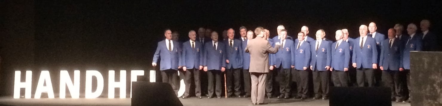
Welsh Male voice choir
…singing We’ll Keep A Welcome in the Vales — When You Come Home Again to Wales

Welsh Veterans Male Choir - Handheld 2013 from Besquare on Vimeo.

Tuesday, 29 October 2013

Droidcon 2013: Remote Styling

Peter Nash

http://nativecss.com/

  • styling using CSS on top of Android views
  • live updating
  • free software — make their money from support

  • can pick up images — automatically cached & scaled to correct size

  • multiple background images on a view
  • can use in both Android & iOS
    • allows platform-specific overrides
  • allows designers to adjust UI
    • using language they understand
    • on multiple devices at once
    • without needing to make a new build
  • can use media queries (e.g. device-width)
  • dynamic styles based on settings in the app
  • can apply a promotion in the app for a day
  • android support:
    • API 10 (2.3) with additional setup
    • API 14 with single line setup
  • suggested as a value for key bits, not for the whole app
  • uses a single CSS for all activities

Tuesday, 4 October 2011

Over The Air 2011: The FT Web app - We've Got a Website for That

Andrew Betts, Assanka @triblondon

  • An app is:
    • responsive design
    • responsive to human interface (mouse, keyboard, touchscreen, TV remote, …)
  • The Daily app is now generating less than 50 tweets a day (and still going down)
    • Down from over 200
  • iPad web app also works on other devices
    • not just tablets – phones too
    • currently only accessibly on iPad
    • works on Android & QNX but not released yet
    • Android imminent, QNX a few months
  • server serves the same code to all devices
    • client does customisation and caches as much as it can
    • so can go offline and still access pages
  • FT web app
    • 8 months with 3 people
    • then additional 4 months with same people to get Android & Playbook

issues

  • flowed columns and flowing text around fixed elements
    • adobe webkit fork has great flow additions - but not available on devices
    • css3 template layouts – but again not supported
    • so have to measure content and cut it into positioned containers using Javascript
  • content balancing
    • always show a whole number of items across the width
    • done by classifying devices into four groups according to screen size
      • small, medium, large, large wide
  • podcast pages
    • want to keep playing audio even when move to another page
    • put audio player at the top of the DOM, so not altered
    • entire app is in a single page – just swap content in and out
  • swiping between sections
    • continuous carousel made out of three divs
    • middle one is always the current
    • outer ones are preloaded as required
    • implemented swipes using touch gestures
    • have to do your own gesture interpretation
      • distinguish between slow drags and flings

tools

  • playbook has remote web debugging
  • WeinRE can do similar, but can’t debug Javascript
  • TouchScroll allows you to keep headers fixed and snap to columns when swiping across
  • web debugging proxies (e.g. Charles)
  • use desktop for layout, but real device for interaction (swiping)

discoveries

  • people use native apps differently
    • they tap lightly and fast
    • the web browser waits for fast taps in case there’s a double tap to zoom
    • if you don’t want double tap to zoom
    • Assanka made fastclick

offline access

  • launching app offline
    • need to specify URLs in app manifest
    • if you change a single file, all of the manifest needs to be re-downloaded
    • store as little as possible
    • the more you store, the longer your app will take to launch
    • iOS manifest is buggy – you can get name conflicts with other webapps
      • so make sure you give your manifest a custom name
    • development is hell – things get cached the whole time
      • instead, add a comment that changes every minute (for dev)
      • still leaves you time to refresh a few times to check the cacheing
  • manifest is no good for editorial content
    • local storage is much faster than SQLite
    • so if you only access by key then use it
    • you need permission to store > 5Mb
    • strategy:
      • launch app from web, just store <= 5Mb and prompt to save to home screen
      • saved from home screen, immediately ask for 50Mb and never ask again
    • images downloaded from server as base64 encoded strings
      • can combine images into single requests
      • and can then gzip the whole thing
      • stored in local SQLite
      • rendered into DOM as a data: URI
      • base64 transfer also avoids operator image recompression!
  • analytics
    • can’t use Google analytics
    • log user actions into local DB
    • POST the log when requesting updated content
    • on the server, rewrite the log into an Apache format access log

unresolved issues

  • SSL security: no browser chrome, so no browser padlock
    • trusted, because we tell you…
  • Social media integration – OAuth in separate window doesn’t work
    • have to reload completely when return to app
  • offline adverts:
    • not technically hard, but ad server companies don’t know how to deal with them
    • can’t retract the ad
    • can’t measure clicks
    • can’t click through at all…
  • automated QA – selenium doesn’t really work
    • ended up using lots of people and lots of devices

platforms

  • Android is by far the poorest web environment when compared with iOS and QNX
    • mainly due to lack of hardware-accelerated CSS transitions
    • so FT have a native Android app which has a single native component – the gallery to enable swiping
    • the rest of the app is HTML/CSS/JS
  • QNX has a native app too, but only to have a home screen icon and to provide distribution

Q&A

  • upset Apple?
    • probably not – FT are specific market
  • differences between web app and native
    • web has more sections than native ever had
    • web app preloads content, so people swipe more often
    • as a result web app gets much more interaction
  • is not appearing in the app store an issue?
    • yes, but instead making tactical native apps
    • e.g. FT Top 100 Companies – tells users if you want the full edition, go to the web app

Over The Air 2011: Crap! It doesn't quite look right!

Or… how I learned to stop worrying and set my web sites free

Lyza Danger Gardner, co-founder Cloud Four @lyzadanger

  • Founder of Cloud Four in 2007
  • Explicitly for mobile web
  • Lyza was on the team that built the Obama app
  • Went through the app and realised that there was nothing in the app that couldn’t be done with the web
  • hautelook.com – high performance mobile web
  • deschutes brewery – one web
    • uses geolocation to find where to buy the beer
  • mobile web is hard and getting harder
    • and it’s not just phones any more…
    • car radios, televisions, …
  • and there’s a whole stack every time (any of which can change)
  • in the 1990s, took print ideas and applied them – pixel perfect
    • customers believed that we had control…
    • “could you move the logo a half pixel to the right?”
  • no one can possibly know enough – devices are continually appearing and you still have to deal with the old stuff
  • how do you deal with WYSIWYG for customers…?

mobilewood

  • 10 highly experienced mobile developers
  • working on where we wanted the mobile web to go
  • built http://futurefriend.ly
  • three pages, two images, no interactivity
  • 100 man hours
  • -> not scaleable!

testing is very hard

take heart!

  • relinquish control over a few things we thought we had down pat

  • four considerations:
    1. content like water
      • consider wireframes that demonstrate the flow and flex of content across a continuum of device and window sizes
      • design approach: like proportion – not pixel perfect
      • build functional mockups, so you can show (not tell)
      • it will be an iterative process
      • will not be an overnight change – it’s not a brochure, despite what we told you earlier
      • it’s often surprising how willing customers will be to adapt or modify their content APIs
      • try using textile or markdown in CMS
    2. essentials first
      • not just mobile – pare down to the essentials
      • not just about design – about process, performance, experience for every user
      • start serene and simple
    3. arm the weapons!
      • responsive web design
      • fluid media: 100% width images
      • fluid grids
      • use media queries to enhance (mobile first)
      • see also Responsive Images (by Scott Jehl)
      • Boston Globe is a showcase
      • it’s ok to leave unmanaged gutter in % widths
      • use Modernizr’s modular approach (don’t test everything)
        • but it’s not infallible
      • use server-side work:
        • reordering – moving navigation around
          • android devices are too buggy
        • reduction – smaller images
        • respect – your users: don’t download graphics if you don’t use them
      • user agent sniffing – it ain’t perfect, but it gets the job done
      • don’t be afraid to do some server-side optimization
      • optimise!
        • especially your htaccess or apache config
        • use YSlow
        • make sure you gzip everything you can (not just html)
        • cache manifests are a little tricky to deal with
      • Cloud Four images:
        • server side sizing using WURFL for major sizes
        • common images are then cached
        • then 100% fluid sizing
    4. draw the line
      • set expectations with your customers
      • explain how you don’t have control over everything
      • don’t be afraid to pull out egregious hacks!
      • be ready to fail gracefully
      • this isn’t religion!
  • frameworks:
  • iOS rotation
    • use -webkit-text-size-adjust:none;

Lyza is writing a book – Head First Mobile Web

Wednesday, 29 September 2010

Over The Air 2010

This was my third Over The Air and it more than lived up to the expectations set by the previous two. Billed as “a grass-roots mobile developer event”, Over The Air is an unmissable event on the mobile developer’s calendar — a weekend of fresh presentations from people who are at the cutting edge, mixed with an overnight hack-a-thon competition with prizes awarded in the final presentation.

This year the organisers went for a couple of keynotes (including the major coup of Tim Berners-Lee on the Sunday morning) as well as over 40 seminars on topics ranging from business oriented pitch and product workshops and DIY PR; through introductions to design & prototyping tools such as Flowella and iProcessing; all the way to detailed technical explanations and tutorials such as using Paypal’s mobile SDKs and Bryan Rieger’s excellent presentation on building mobile and desktop compatible web sites (of which more later).

I’ve put my rough notes on the presentations below, but it’s worth checking out the other presentations that were spotlighted on Slideshare and the other blog entries featured in the overtheair twitter stream.

I also entered the hack-a-thon competition and won Best Hardware Hack as well as Best use of “other features”?! for my LEGO Mindstorms robot with an iPhone brain that followed faces. I’ll be posting the code for my hack shortly…

Keynote: the art of emotional design

Aral Balkan — @aral

  • when computers made the impossible, possible, features mattered
    • …and it didn’t matter if the interface was hard
  • mobile phones are now a commodity, but we’re willing to pay extra for some things
    • “I think Apple is on to something”
  • you cannot compete on features any more:
    • when infrastructure is commoditized, the differentiating factor is User Experience
  • Le Petit Prince: “perfection is achieved … when there is nothing left to take away”
  • you need someone with the authority and responsibility to say “no” to extra features
  • “usable” = “edible”
  • we want to aim for “magical”
  • Aral tries to stay “naive” so that he can understand interfaces from the point of view of an everyday person (not a developer)
  • don’t trick the user
  • build in “delighters”
    • not required for interaction, but…
  • oslo bullet train ticket machine:
    • just a credit card slot
    • exit also has a credit card swipe
    • can get a receipt later online
    • made a difficult decision: knew that fraud rates would go up
    • but worth it for increased usage
  • dangers:
    • weakest link is what is not under your control
    • e.g. facebook pulled the plug on Feathers for Facebook (now Feathers Visage) without warning, just as the app was featured on the German and Austrian app store

DIY research workshop – informing the design process

Mark A.M. Kramer — @mamk

  • users have different issues to those in the mobile industry
  • Mark does “nomadic ethnography” — mainly based on trains :-)
  • often finds himself being a participatory observer
  • Mobile research methods
    • e.g. woman on circle line instinctively knew when network was available — put the paper down and switched to checking her mail
  • iPhone is a good ethnography tool — can take pictures secretly!
  • mobile also enables surveys in the field
  • culture is changing:
    • mobile is enabling “just in time” — e.g. “just google that”

Mark then showed us various interviews:

  • inventor of makerbot and thingiverse:
    • “share or die”
    • integrate game mechanics into whatever you’re doing
  • reactable music interface:
    • play along
    • make it fun
    • can really make instruments with accelerometer
  • feature phone user from Eastern Europe (no smart phone culture):
    • want something I can read my magazines on (comic books)
    • but want it portable
    • I’ve seen others using iPads etc.
    • social shaping of technology
  • 10 year old — what I like about my iPod touch:
    • app developers will become rich if they make something that people like
    • he likes games
    • doesn’t want to pay for things

things to think about:

  • eWaste — what about all those unused phones?
  • social isolation
  • generational differences
  • impact on children
  • designing for inclusion & accessibility

Orange Mobilise – the mobile volunteering initiative

David Simoes-Brown (Strategy Partner at 100%Open), Jogesh Limbani (Head of Open Innovation at Orange R&D UK)

  • Orange using open innovation to encourage ideas to come in to Orange
    • The Wisdom of Crowds, James Surowiecki
    • Cognitive Surplus, Clay Shirky — 100 million hours of adverts watched over one weekend in America, equivalent to the amount of time taken to create wikipedia
  • Orange want to help minutes matter
  • Tuangou (cloud clout buying) in China
    • gathering people together to negotiate a discount
  • Orange want to capture 5 minutes a day from the 3h 45m TV watching for volunteering
  • Have previously launched Orange Rock Corps — can earn a ticket to a gig by volunteering
  • 1 million people giving 5 minutes = a decade of real time
  • http://mobilevolunteering.co.uk:
    • Orange building an app (iPhone to begin with)
    • Gathering ideas
    • Promoting existing apps
  • Challenge:
    • can pick an app from suggested ideas
    • contact the author and go
    • OR submit an existing suitable app
  • Orange will launch the top three voted apps & actions in October
  • Will also launch 7 other apps & ideas as chosen by Orange rather than community
  • Voting criteria:
    • You’re on the bus with five minutes before the stop — what can you do?
    • Popular & used often
    • Has a clear social or environmental benefit
    • Practical & attractive to a sponsor charity — needs a backup
    • Looking for a balance of actions:
    • research | lookout | reach out | skill set
    • Also looking for a balance of purposes
  • suggest to look at latest & most active rather than top scoring

Rethinking the Mobile Web – a pragmatic look at creating an accessible and inclusive mobile experience

Bryan Rieger @bryanrieger

Bryan gave a fantastic presentation about how to make workable web sites for mobile and desktop use. There’s also a whole load of discussion on slideshare below the presentation about different approaches. The how-to bits of the presentation start from about slide 104, but there’s a load of stats up front to convince you that having a mobile-friendly site is worth it, and that mobile-friendly does not just mean iPhone…

  • iPhone in US only covers about 6% of the population and only 4% of 5 major EU countries
  • Huge impact but not huge penetration (at least of people, but huge percentage of traffic…)
  • nice comparison of older (desktop) Macs vs recent mobile phones
  • feature phones of today are the smartphones of yesterday
  • the old devices don’t suck
  • gs.statcounter.com stats from 02/2010
    • lots of Opera Mini in Nigeria
    • lots of BlackBerry in Australia
    • in Feb. the UC proxy browser ate Nokia’s Chinese market share
    • Nokia bought Novarra in March 2010…
  • going forward, main browsers in use are WebKit and Opera Mini
    • coming up later are Mozilla Fennec (will be Firefox Mobile), Ovi & UC proxy browsers
  • why is it ok to say “this site works best on Safari 4”, when it wasn’t ok to say “this site works best with IE 4…”?
  • design “mobile first”
    • @media queries often fail — so taking a desktop site + media queries results in a desktop site on mobile
    • mobile site + @media queries => desktop site
    • not a new idea — just progressive enhancement!
  • use screen and handheld types for first stylesheet
  • book recommendation: DOM Scripting by @adactio (if jQuery not available…)
  • http://tinysrc.net will resize and compress image for you
  • infographics may need reinterpretation for smaller screens, rather than just resizing
  • a bit of a dream: Bryan would like to extend the <img> tag to have multiple images for different screen sizes
  • Q&A: Opera has device stats available from http://www.opera.com/smw/

Viral Survival Kit: Cloud Computing for Highly Scalable Apps

Matt Wood, Amazon Web Services — mawood@amazon.com

A quick overview of Amazon’s cloud services. Useful for working out what you might need. I was kind of hoping for something more technical, but this is good too. Especially useful is the link to the Amazon Simple Calculator, so you can work out how much your requirements might cost.

  • Amazon started with two servers (1 db, 1 app server)
  • They refactored so that:
    • dev teams could request resources on demand
    • wouldn’t have to worry about scaling & reliability
  • AWS is a datacentre abstraction
  • can provision a server in about 20-25 seconds (though Windows servers take a little longer due to security certificate isses)
  • guardian open platform is delivered using AWS

S3 & CloudFront

  • all data is replicated to three different centres
  • scaled automatically as demand rises
  • can have a reduced redundancy service at lower cost (only 5 9s rather than 11…)
  • CloudFront provides CDN

other services

  • RDS: relational datastore — MySQL as a service
  • EBS: elastic block store
  • EMR: elastic map reduce — hadoop on demand
  • VPC: virtual private cloud — elastic resources in the cloud appear in your own network through a VPN
  • CloudWatch: monitoring, autoscaling
  • ELB: elastic load balancer

some detail

  • m1.small available for about 8¢/hour
  • m1.large has more CPU etc
  • t1.micro is even smaller, only 2¢/hour
    • tight RAM constraints (600Mb), but has automatic CPU scaling
  • can plan over longer term and get reduced price (0.07¢/hour if you pay $50 upfront)

designing for failure

  • can attach an elastic IP address to an instance
  • if server fails, can just repoint to another instance in the same datacentre
  • also deal with datacentre failures
    • four regions (East Coast, West Coast, Dublin, Singapore)
    • each region has multiple availability regions
  • RDS can enable master/slave with an API call

automation

  • can pull monitoring data into ganglia
  • monitoring can be connected to autoscaling
  • can set thresholds for setting up and killing servers
  • integrated with availability zones

security

  • can have multiple roles with fine grained access
  • provide mitigation against DDOS
  • default-deny firewall
  • see http://aws.amazon.com/security for details
  • data stays within regions

Q & A

What Would Picasso Do — a panel of art and technology

Another brilliant Bryan Rieger production: find six people with interesting ideas and ask them to inspire the audience by talking about what they liked. It worked…

Tom has been thinking about…

  • Joseph Beuys: “everyone is an artist”
  • Music industry history is minuscule compared to whole history of art
    • we focus on near-sighted things
  • Art doesn’t seem to scale
    • engineering efforts can take 100Ks of people
    • what would art equivalents look like
  • Constraints feed creativity

mills is enabling creativity…

  • granimator: enabling the public to create screen backgrounds
    • invite artists to contribute assets
  • making creativity accessible

matthias has been playing with plasticine…

  • dali from 1950s: gem-decorated heart with pumping action
  • we work on the surface with the gems at the moment
  • need to work deeper
  • plasticine interfaces — when they’re rough, people want to grab them and play
  • Sony has a big blue design book
    • explored wireless headsets in 80s
    • worked in the home, but in shared spaces you would get someone else’s music
    • dismissed at the time, but might now be treated as an interesting feature

Jason has been looking at apps…

  • UK is much more advanced than US in area of IPTV & set-top boxes

Filip has been thinking about art…

  • linear vs dynamic
  • goals vs accidents
  • framing / positioning
  • interactive vs reactive
  • sense of ownership

Q & A

  • Are creative apps on iPad/iPhone merely frivolous?
    • e.g. Brushes, Magic Piano
    • TH: 11-point multitouch is not frivolous
    • JF: a device to interact with while watching TV
    • TH: Jeff Minter: apps for Amiga
    • no intermediation — straight onto the screen
  • Are there any useful consequences of art-related apps? Can they be applied to productivity-related apps?
    • TH: epic win: a todo list manager that takes game mechanics and gives you experience points for completing todo items…

tweetalondoncab

This wasn’t a presentation on the main schedule, just the cabbie who started @tweetalondoncab talking about where he’s got to and where he wants to go.

  • gone from 2 drivers to 120!
  • however, can’t cope with more than 3-4 jobs at a time

process

  1. customer DMs to @tweetalondoncab
    • may have to come back to them and get further details (inc phone number)
  2. the chair account (protected account) advertises the job (removing specifics) with phone number of person in chair
  3. drivers get a text alert when tweet sent from chair account
  4. driver responds with a phone call and gets job allocated
    • receives phone number and address of pickup
  5. chair account sends out that job has been allocated
  6. chair account informs customer of their driver’s details
  7. driver contacts customer by phone when they’re ready

also have @cabup protected account that provides shared information updates on demand & traffic — added value for drivers who join in

future ideas

  • would like to include cab sharing
  • still want to advertise to all drivers as it’s their decision to take it
    • first come first served at the moment
    • but would like to add in how long the driver would take to get there
    • especially for higher value jobs (e.g. Victoria -> Gatwick)
  • want to attract people who would normally order a private minicab

constraints & ideas

  • dealing with 3-4 jobs coming in at once
    • if can see all cabs on map, would be able to tell customers that can’t help within 30 mins
    • driver claiming job is pinch point
    • have a link to a page with how many minutes to be there
    • claim the job automatically
    • could have a form to submit info, so jobs are better structured

Keynote: Sir Tim Berners-Lee

I didn’t get to take many notes during Sir Tim’s keynote as I was busy finishing my hack (of which more in the next post). He was an inspiring speaker in his own way — you could see the passion for his subject shining through.

His main points were about ensuring things are referable, and that the reference can (and should) be done with URLs.

  • if an app doesn’t have a URL then it can’t be linked
  • it doesn’t get the interestingness — people can’t use it for other things